Grouping and analysing SNOMED CT data
This tutorial demonstrates how to group and analyse SNOMED CT data using Python with the Pathling library and a terminology server. The process involves setting up a Python environment, loading and transforming data, creating value sets for grouping, and visualising the results.
Setting up the environment
The first step is to set up the environment. This
involves importing the necessary libraries: pathling for SNOMED data
operations, along with data manipulation and visualisation libraries.
- Python
- R
from pathling import PathlingContext
from pyspark.sql.functions import col, month
import plotly.express as px
library(sparklyr)
library(pathling)
library(dplyr)
library(ggplot2)
Configuring Pathling
A Pathling context is created and configured to use a local terminology cache. This helps to speed up the analysis by reusing terminology requests.
- Python
- R
pc = PathlingContext.create()
pc <- pathling_connect()
Loading and transforming data
The source data is loaded from a CSV file, and new columns are added for ' Arrival Month' and 'Primary Diagnosis Term' by retrieving preferred terms from the terminology server.
- Python
- R
source_df = pc.spark.read.csv("snomed_data.csv", header=True)

transformed_df = source_df.select(
    col("id"),
    month(col("arrive_at")).alias("Arrival Month"),
    col("primary_diagnosis_concept")
).withColumn(
    "Primary Diagnosis Term",
    pc.snomed.display(col("primary_diagnosis_concept"))
)
source_df <- pathling_spark(pc) %>%
        spark_read_csv("snomed_data.csv", header = TRUE)

transformed_df <- source_df %>%
        select(
                id,
                "Arrival Month" = month(arrive_at),
                primary_diagnosis_concept
        ) %>%
        mutate(
                "Primary Diagnosis Term" = !!tx_display(!!tx_to_snomed_coding(primary_diagnosis_concept))
        )
Grouping with value sets
The core of the grouping process involves defining value sets based on SNOMED codes. The video provides examples for creating value sets for "Viral Infection", "Musculoskeletal Injury", and "Mental Health Problem" using Expression Constraint Language (ECL). The Shrimp terminology browser is used to explore SNOMED hierarchies and create these ECL expressions.
- Python
- R
viral_infection_ecl = "<< 64572001"  # Viral disease
musculoskeletal_injury_ecl = "<< 263534002"  # Injury of musculoskeletal system
mental_health_ecl = "<< 40733004 |Mental state finding|"

categorized_df = transformed_df.withColumn(
    "Viral Infection",
    pc.snomed.member_of(col("primary_diagnosis_concept"), viral_infection_ecl)
).withColumn(
    "Musculoskeletal Injury",
    pc.snomed.member_of(col("primary_diagnosis_concept"),
                        musculoskeletal_injury_ecl)
).withColumn(
    "Mental Health Problem",
    pc.snomed.member_of(col("primary_diagnosis_concept"), mental_health_ecl)
)
viral_infection_ecl <- "<< 64572001"  # Viral disease
musculoskeletal_injury_ecl <- "<< 263534002"  # Injury of musculoskeletal system
mental_health_ecl <- "<< 40733004 |Mental state finding|"

categorized_df <- transformed_df %>%
        mutate(
                "Viral Infection" = !!tx_member_of(
                        !!tx_to_snomed_coding(primary_diagnosis_concept),
                        !!tx_to_ecl_value_set(viral_infection_ecl)
                ),
                "Musculoskeletal Injury" = !!tx_member_of(
                        !!tx_to_snomed_coding(primary_diagnosis_concept),
                        !!tx_to_ecl_value_set(musculoskeletal_injury_ecl)
                ),
                "Mental Health Problem" = !!tx_member_of(
                        !!tx_to_snomed_coding(primary_diagnosis_concept),
                        !!tx_to_ecl_value_set(mental_health_ecl)
                )
        )
Handling overlapping categories
Due to the nature of SNOMED's multiple parentage, some categories may overlap. For instance, a condition like "rabies coma" can be classified as both a viral infection and a mental health finding. The data is grouped by 'Arrival Month' to count all encounters and then visualised to show the number of encounters per month for each category.
- Python
- R
all_encounters_df = categorized_df.groupBy(
    "Arrival Month").count().withColumnRenamed("count", "All Encounters")
viral_infection_count_df = categorized_df.filter(
    col("Viral Infection")).groupBy("Arrival Month").count().withColumnRenamed(
    "count", "Viral Infection")
musculoskeletal_injury_count_df = categorized_df.filter(
    col("Musculoskeletal Injury")).groupBy(
    "Arrival Month").count().withColumnRenamed("count",
                                               "Musculoskeletal Injury")
mental_health_count_df = categorized_df.filter(
    col("Mental Health Problem")).groupBy(
    "Arrival Month").count().withColumnRenamed("count", "Mental Health Problem")

# Code for joining these dataframes and creating a Plotly chart would follow
all_encounters_df <- categorized_df %>%
        group_by(`Arrival Month`) %>%
        summarise("All Encounters" = n(), .groups = "drop")

viral_infection_count_df <- categorized_df %>%
        filter(`Viral Infection`) %>%
        group_by(`Arrival Month`) %>%
        summarise("Viral Infection" = n(), .groups = "drop")

musculoskeletal_injury_count_df <- categorized_df %>%
        filter(`Musculoskeletal Injury`) %>%
        group_by(`Arrival Month`) %>%
        summarise("Musculoskeletal Injury" = n(), .groups = "drop")

mental_health_count_df <- categorized_df %>%
        filter(`Mental Health Problem`) %>%
        group_by(`Arrival Month`) %>%
        summarise("Mental Health Problem" = n(), .groups = "drop")

# Code for joining these dataframes and creating a ggplot chart would follow
Creating mutually exclusive categories
To avoid overlapping categories, a hierarchy is created. "Viral Infection" is the first category, followed by "Musculoskeletal Injury," which excludes any codes already in the "Viral Infection" category. The "Mental Health Problem" category then excludes any codes already present in the previous two categories. An "Other" category is also created for any remaining codes.
- Python
- R
mutually_exclusive_df = categorized_df.withColumn(
    "Category",
    when(col("Viral Infection"), "Viral Infection")
    .when(~col("Viral Infection") & col("Musculoskeletal Injury"),
          "Musculoskeletal Injury")
    .when(~col("Viral Infection") & ~col("Musculoskeletal Injury") & col(
        "Mental Health Problem"), "Mental Health Problem")
    .otherwise("Other")
)
mutually_exclusive_df <- categorized_df %>%
        mutate(
                Category = case_when(
                        `Viral Infection` ~ "Viral Infection",
                        !`Viral Infection` & `Musculoskeletal Injury` ~ "Musculoskeletal Injury",
                        !`Viral Infection` &
                                !`Musculoskeletal Injury` &
                                `Mental Health Problem` ~ "Mental Health Problem",
                        TRUE ~ "Other"
                )
        )
Visualisation of mutually exclusive categories
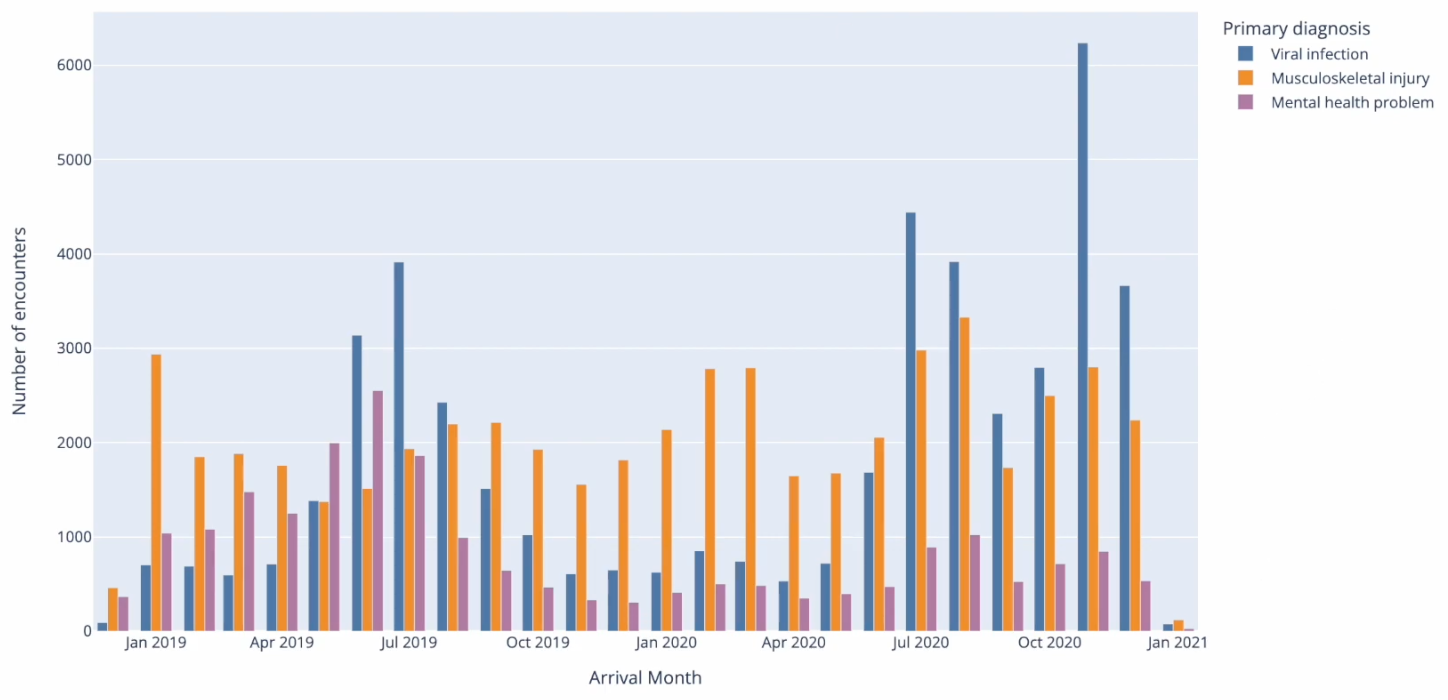
The mutually exclusive categories are then counted and visualised in a grouped bar chart, showing the proportional distribution of these categories over time.
- Python
- R
mutually_exclusive_counts_df = mutually_exclusive_df.groupBy("Arrival Month",
                                                             "Category").count()

fig = px.bar(
    mutually_exclusive_counts_df.toPandas(),
    x="Arrival Month",
    y="count",
    color="Category",
    barmode="group"
)
fig.show()
mutually_exclusive_counts_df <- mutually_exclusive_df %>%
        group_by(`Arrival Month`, Category) %>%
        summarise(count = n(), .groups = "drop")

# Convert to local R dataframe for plotting
plot_data <- mutually_exclusive_counts_df %>% collect()

# Create grouped bar chart
ggplot(plot_data, aes(x = `Arrival Month`, y = count, fill = Category)) +
        geom_col(position = "dodge") +
        labs(x = "Arrival Month", y = "Count", fill = "Category") +
        theme_minimal()

# Disconnect from Pathling
pc %>% pathling_disconnect()
For more detailed information on grouping SNOMED data, you can refer to Terminology functions.